
A simple agency finance dashboard
An at-a-glance way to see if finances are healthy & balanced …
In the first post in this series, I wrote about how agency finances work, setting out how we believe it is more about balance than targets.
We wanted to be able to make this balance in our finances easily visible to help manage our business.
This is extra important for us because we’ve done away with management review of things like holidays, expenses, professional development and so on — replacing it with an open peer-review system (part of our ‘Free Range’ culture). In order for this to work, everyone has to have enough information about the business to make good peer-review decisions. If someone wants to spend £2.5k on a new laptop and you’re doing the peer review, you need to know and understand the status of the company finances in order to make a healthy decision.
Solving the messy spreadsheet problem
One of the most frequent wishes I hear from other agency owners I meet is for a simple dashboard to help them and their teams understand the financial status and outlook for their business.
Too often they end up with multiple tables spread across multiple spreadsheets that nobody looks at much, and only a few understand. In the last agency I co-founded, one of my business partners had an MBA and so, along with the CFO who was ex-Ernst and Young, he took on the finance and reporting. After three years their dream of the perfect system was still ‘not quite ready’, so a 170-person business was being run across 9 countries from multiple accounting systems and a mess of an Excel sheet that was packed with different tables of numbers, took ages for them to update and circulate by email each month, and did nothing to ‘tell the story’ of the business.
Telling the story of a business is what I think is key in management reporting. Simply presenting big lists of historical numbers is useless. There needs to be context, analysis and simple narrative. It needs to be a starter for useful conversations.
In Convivio we are striving for radical transparency (becoming the first digital agency in the UK to be awarded the Fair Tax Mark as one of the results of this). Therefore, we wanted to make it really easy for every member of the team to see and understand our financial outlook.
The journey to the Convivio Dashboard
We started this project two years ago. My colleague, Lewis Nyman, carried out user research with the Convivio team to find out their needs for information to help them understand company finances.Meanwhile, I conducted research with other agency leaders to find out what they were doing, as well as compiling notes from my good and bad experiences of running professional services businesses of varying sizes for the last 20(!) years. From this, I refined my approach to agency finance metrics, and developed the metrics I described in my last blog post ‘How healthy agency finances work’.
To build a dashboard based on these two streams of research we established a few principles:
- Let’s build the simplest possible dashboard at first, not the perfect one. We evaluated various specialist dashboard and finance reporting tools but decided that Google sheets and charts would give us the quickest easiest way to prototype, test and iterate our ideas.
- The border of this project stays within the Google spreadsheet for now. We will not try to do any fancy integrations with our accounting system, or anything external. This will make it quicker and cheaper to iterate the dashboard, though creating a small overhead for the manual data entry work.
- It has to be easy to update, just putting key data in a few clear cells, so it’s not an onerous task that is dreaded.
- The output should be graphical rather than numerical.
- It should be a starter for conversations with useful questions rather than trying to present all the answers.
- Let’s build something that others can use, too. A key value of ours is ‘sharing’ so when we build something useful we release it as open source, and publish it.
We developed a first rough-and-ready version of the dashboard and began using it to report our monthly numbers.
Lewis carried out usability testing with the team to see how they understood the information on the dashboard, and what conclusions they drew from it. Our first lesson was on improving the descriptions and labels on the charts. We also decided that there was some lightweight training needed about the metrics themselves and how they tell us stories, roughly as summarised in my last blog post. This would be okay, as our audience is internal and this is a specialist tool. It doesn’t need to be understood at a glance by any general member of the public.
But then our next lesson was that monthly reporting wasn't that useful. What was more useful to discussion was how our year was shaping up. We therefore switched the dashboard to reflect our forecast for the results for the current financial year, and each month the forecast would be updated now we had more ‘actual’ data within it.
This proved much more useful, so in version 2 we merged our dashboard and our forecast together. I’ll blog separately about the way we do forecasting. All you need to know for now is that the dashboard shows a snapshot of the current forecast for the year.
Running through an example: Convivio in 2018
To illustrate how the dashboard works, I’m going to walk through the story it tells about our last full financial year, so all the numbers by this stage are ‘actuals’. I’ve already blogged about the financial results in detail, this is just showing the simple dashboard view of them.
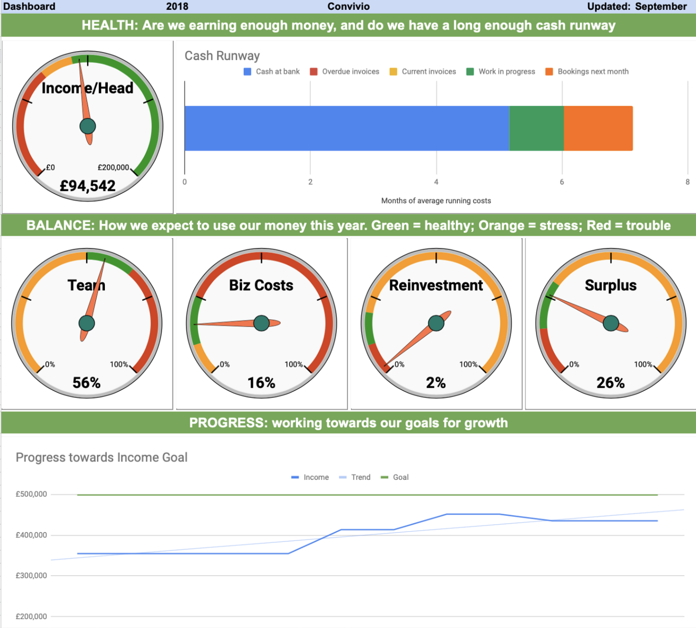
The financial health of the business
Firstly we have the financial health section of the dashboard. This tells us:
- Income/head: the level of money coming into the company. It’s in a ratio like this so that we’re more focused on the balance of income against our size than about a big headline turnover number. If we keep this number balanced while we grow, we’ll stay healthy. Meanwhile just knowing your turnover is growing doesn’t tell you anything about financial health.
- Cash runway: money we have available to us already in case money stops coming in. This is a simplistic cashflow healthcheck. It plots the money we have in various categories against the number of months of average running costs it would cover. So if another 2008 crash happened and all income stopped for a few months, this shows how many months the business could survive with no other income at all.
So here’s the story these two charts show about our business…
The left hand gauge shows the average income per head for the year. In this case, it was just into the green zone, meaning it’s healthy. The orange zone would be survivable but stressful, the red zone would mean danger.
The cash runway on the right hand side showed that, at the date this snapshot was taken, we had built up over 5-months’-worth of cash in the bank (though at that point some invoices had only just been paid early so there are none overdue or issued), there was just under a month of work in progress about to be invoiced, and already over a month’s-worth booked in for the following 30 days. That tells us we’re reasonably healthy for cash. Alarm bells would start to ring if there was less than a few months’ cash in the bank, less than a month’s worth of work booked in over the next 30 days, and so on. The key is not to just look at how many months are represented but at the story each section of the bar chart tells.
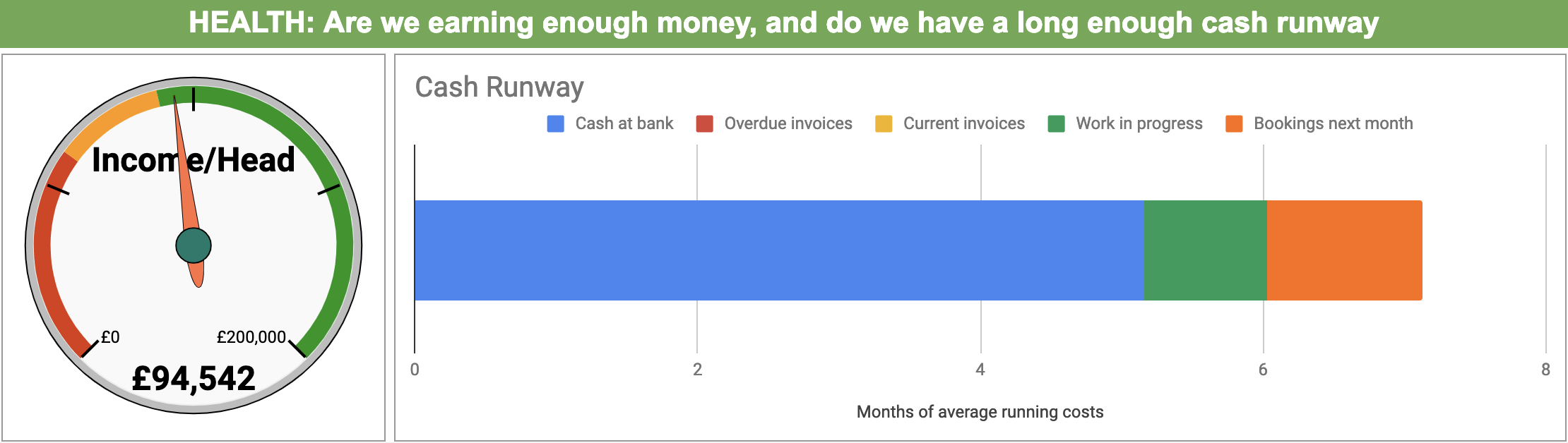
Financial balance in the business
In the next section we focus on the balance of how our real income is used in the business. For details of the thinking behind this row, see my previous blog post on how healthy agency finances work.
In this case, we can see that team and business costs are in the healthy zone, although at the lower end of the zone. The first thing we do is check the link between Income/Head above, and Team costs here, and find that these two are roughly in balance, which is good.
The alarm bell is how low reinvestment is. This is because last summer we became alert to the looming self-inflicted economic problems the UK would face this year, and decided to pause growth plans, and conserve cash instead to provide a safety net. This meant we postponed a plan to recruit, dialled back on marketing activity, and we also made the shared decision to reduce our professional development activities such as attending conferences. This is fine as a short term planned action, but otherwise would suggest we were neglecting to nurture the future of the business, and would merit attention and discussion.
The result of this is that the surplus for the year was high, as intended. In interpreting this dial, we can also look to the cash runway above. This shows that the high surplus resulted in us having a good amount of cash in the bank to help us through any upcoming tough economic weather, which was our aim.
So you can see how this line of gauges tells a story, and also completes a circle with the story told by the charts in the row above.
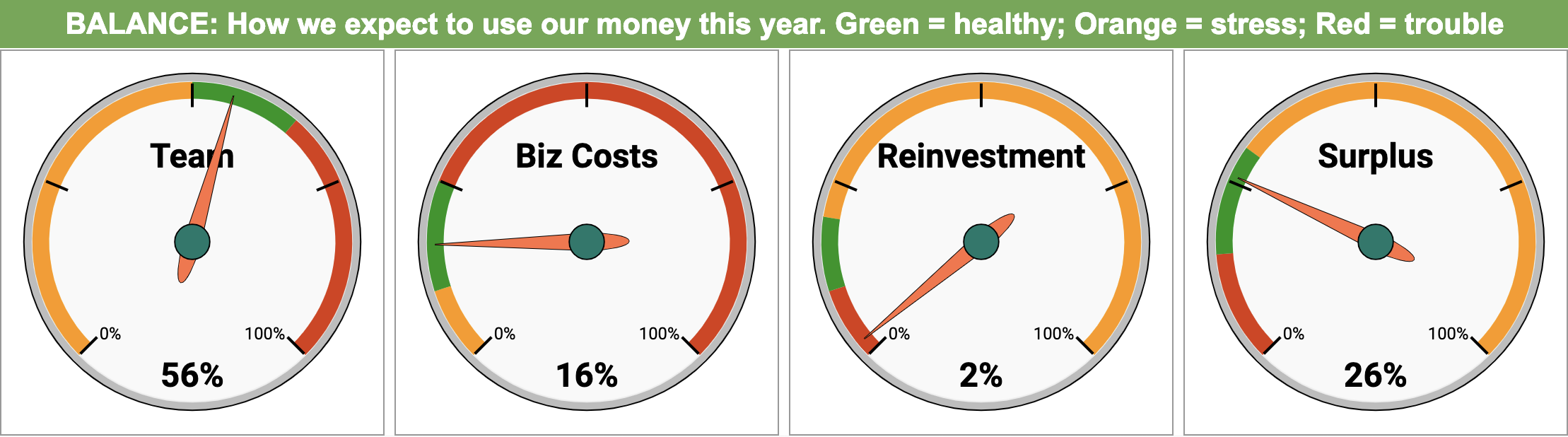
Progress in growing the business
The next chart down is the one that tracks our progress over the year. This is based on how our forecast for the year changed each month.
I’ll write a separate blog post to explain our forecasting approach, as that’s also a bit different. For us, a forecast is not a budget or a set of aspirational targets — it’s a weather forecast. That means it is our best guess of how the future will work out, given the current data we have available combined with our experience and judgment.
Separately to this we set a goal for the Real Income we want to reach in a year. The chart then tracks the progress of our forecast to, or away from, that goal — and the conversation becomes about how to narrow the gap.
Here you can see that we set a goal of £500k of Real Income for the 2018 year (we’re only a tiny new business). At the start of the year our forecast was that we’d do just over £350k, but over the course of the year we were able to gradually adjust this upwards as we became more confident. However, in the summer we took a view on the political developments in the UK and the effect they’d have on the economy, and decided to be cautious, rather than grow. I described some of the measures above. Because we pulled a plan to recruit more staff, this also meant we reduced our expectations for sales a little (they wouldn’t have done much billable work as new recruits, but still enough to meet our goal).
Again you can see how this chart tells a story across the year, and how the story circles back to the rest of the dashboard. It all works together to tell different angles on the same story.
Summary
Having a simple dashboard that tells the story of the business rather than just reporting numbers is about showing the health, balance and progress on one page. Using this dashboard, any member of the team in Convivio can quickly understand how we’re doing financially, and use that to make decisions.
We’ll be open-sourcing and publishing this dashboard soon, so you can try it out for yourself.
In the next blog post in this series, I’ll explain how we forecast our finances.
- Previous Post: How healthy agency finances work
- Next Post: Healthy financial forecasting
If you want to continue the conversation I’m @steveparks on Twitter.
Upcoming Agency Finances Workshop:
Intrigued and want to find out more? Join us for a workshop where you can learn a balanced way to think about agency finances, and develop a dashboard giving your leadership team a clear view of your business.
This post was originally published on our Medium blog at https://blog.weareconvivio.com/a-simple-agency-finance-dashboard-45073edfcdc9